What is Giving Compass?
We connect donors to learning resources and ways to support community-led solutions. Learn more about us.
Giving Compass' Take:
• Homi Kharas and Brina Seidel examine the "elephant chart" — which shows the disparities in global income distribution from 1988 to 2008 — and use current data to see what still holds up.
• What Brookings finds is that poorer countries have grown the fastest over the past 20 years, but the distributional gains are "far from settled fact." Aid organizations should take a close look at the findings and see how it aligns with policy. The elephant shape doesn't tell the whole story, even as globalization fears continue to rise.
• Here's how impact investing can play a big role in making sure the pay gaps close, especially when it comes to gender.
In 2013, Christoph Lakner and Branko Milanovic published a graph — quickly dubbed the “elephant chart” — that depicts changes in income distribution across the world between 1988 and 2008. The chart has been used to support numerous reports of rising inequality fueled by increased globalization. Every time a populist movement rises, every time the elite gather in Davos, every time Oxfam publishes a new report on inequality, the elephant chart resurfaces.
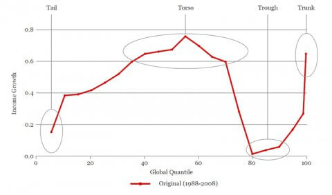
It has been used as evidence to support four stylized facts about who has benefited from globalization:
- The global elite, in particular the top 1 percent, have enjoyed massive income growth over the past decades. Their high income growth, coupled with a high initial share of income, implies they continue to capture a large share of global income growth. This can be seen in the elephant’s raised trunk.
- The global upper middle class has seen its income stagnate with zero growth over two decades for the 80th This appears to corroborate data showing stagnant real wage growth and other frustrations fueling populist politics in rich countries. This can be seen in the depth of the trough at the base of the elephant’s trunk.
- The global middle class has risen rapidly as select developing countries have begun to converge toward rich countries. Countries like China have lifted large impoverished populations into the middle class. This can be seen in the graph’s peak at the elephant’s torso.
- The global extreme poor have largely been left behind, with several countries stuck in a cycle of poverty and violence. This can be seen in the elephant’s slumped tail.
This paper examines how these four parts of the elephant chart — tail, torso, trough, and trunk — hold up to new data and new methods. We caution that while elements of the original story have certainly been confirmed by other data in other contexts, the elephant shape itself may be an overburdened and inaccurate depiction of what is really going on in the world economy.
Read the full article about revisiting the "elephant chart" on globalization by Homi Kharas and Brina Seidel at Brookings.